


the Rice | Branding
Satisfaction of appetite is the easiest way to happiness. Taiwan’s local rice brand “the Rice” (友米友田) oversees their rice with utmost quality and selection in hope that everyone who eats their rice will experience a simple happiness.
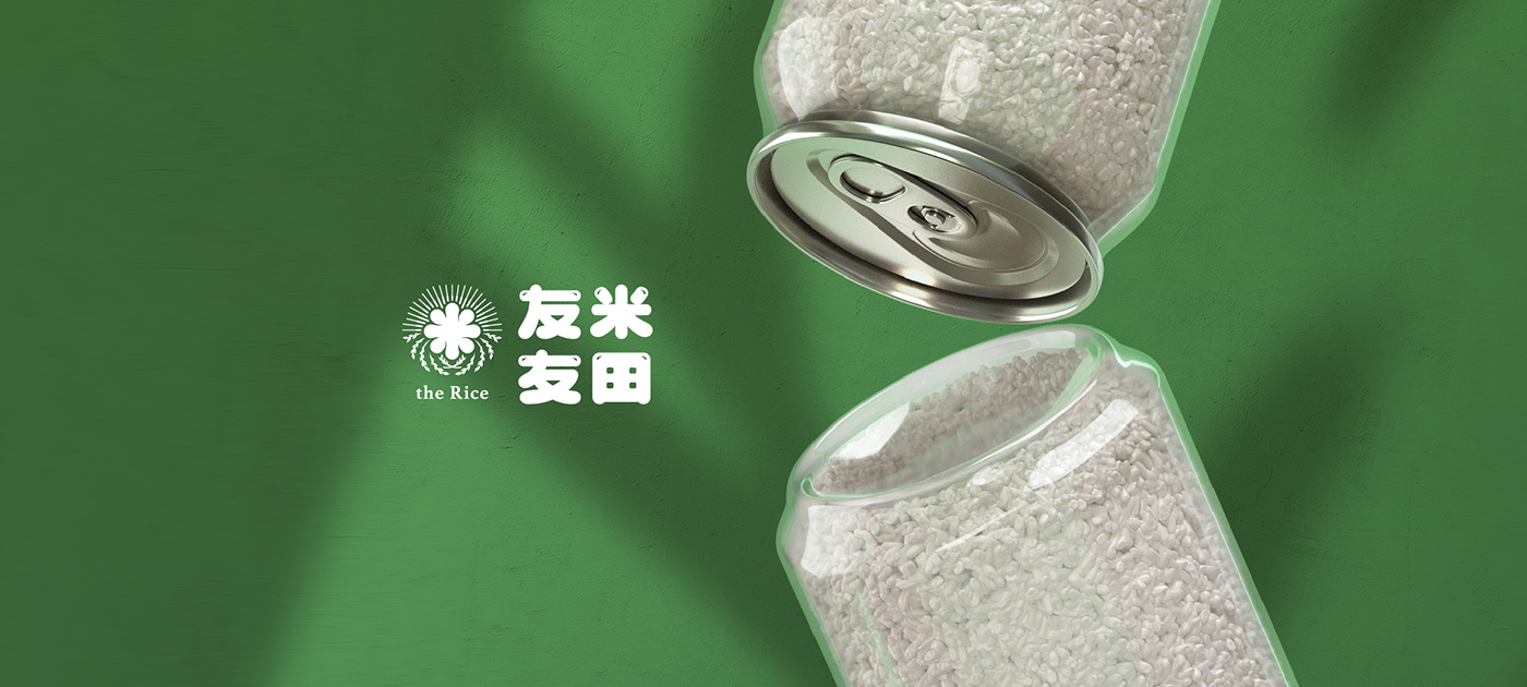
The logo adopts the rich and sticky texture of rice and forms into the Chinese character "米", which means rice. Behind "米" are streams of lights, imitating the sunlit rice field during harvest. The logo is accompanied by a retro color palette, displaying authentic Taiwanese characteristics.


Credits
Type | Branding
Year | 2021
Client|the Rice
Production|Grandvity Design
Creative Concepnt|Andy Kao
Art Director|Noodlemaker
Project Manager|Sarah Peng/Grape Chiu
Typography Designer|Si Jia Sun
Designer|Jason Lee/Show Yen


